Context and challenges
The existing Personal Independence Payments (PIP) process starts with a phone call. My work with DWP was to help digitise the PIP Case review process so that case officers could review cases faster and more accurately.
Design approach - key improvements
Collaboration -
I was part of a multidisciplinary team to digitise the PIP Case review. This was an internal set of screens for case managers to review an incoming application. Plus any supporting evidence in order to send it on for a decision or refer for further assessment. The content is broken down iand grouped into 4 main sections. Personal Details, Conditions, Activities and Questions and Answers.
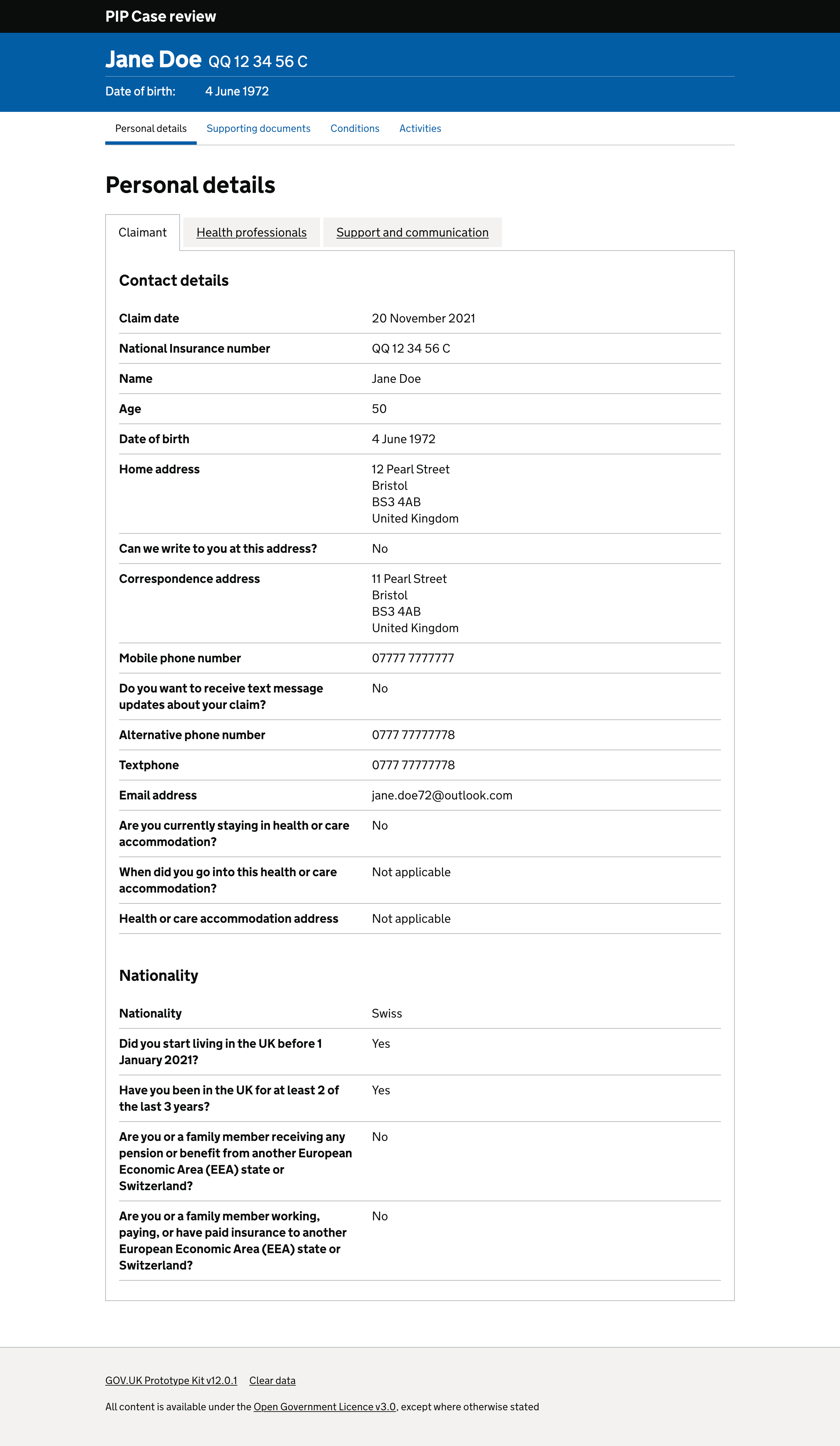
Personal details - Split into sections using tabs to allow caseworkers to find contact details for the applicant, health professional and any additional support or communication preferences.
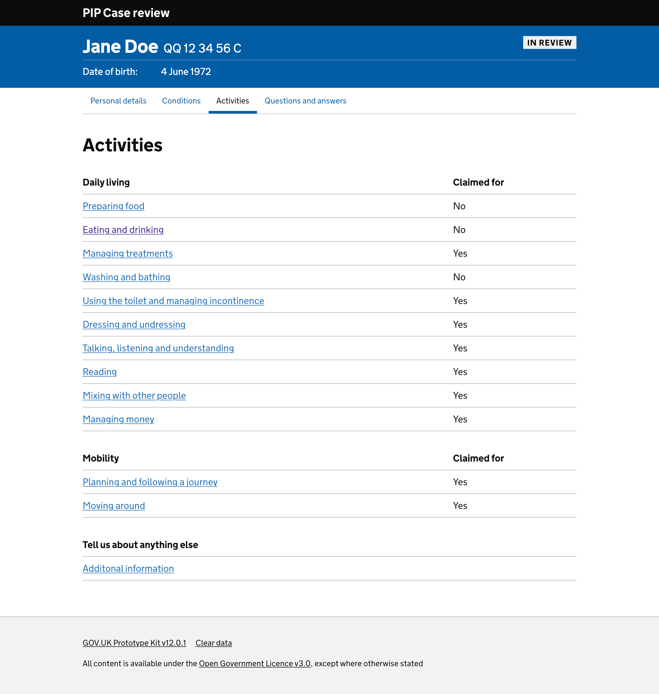
Conditions and activities - Core criteria for the assessment and an applicants responses for each needs to be displayed clearly.
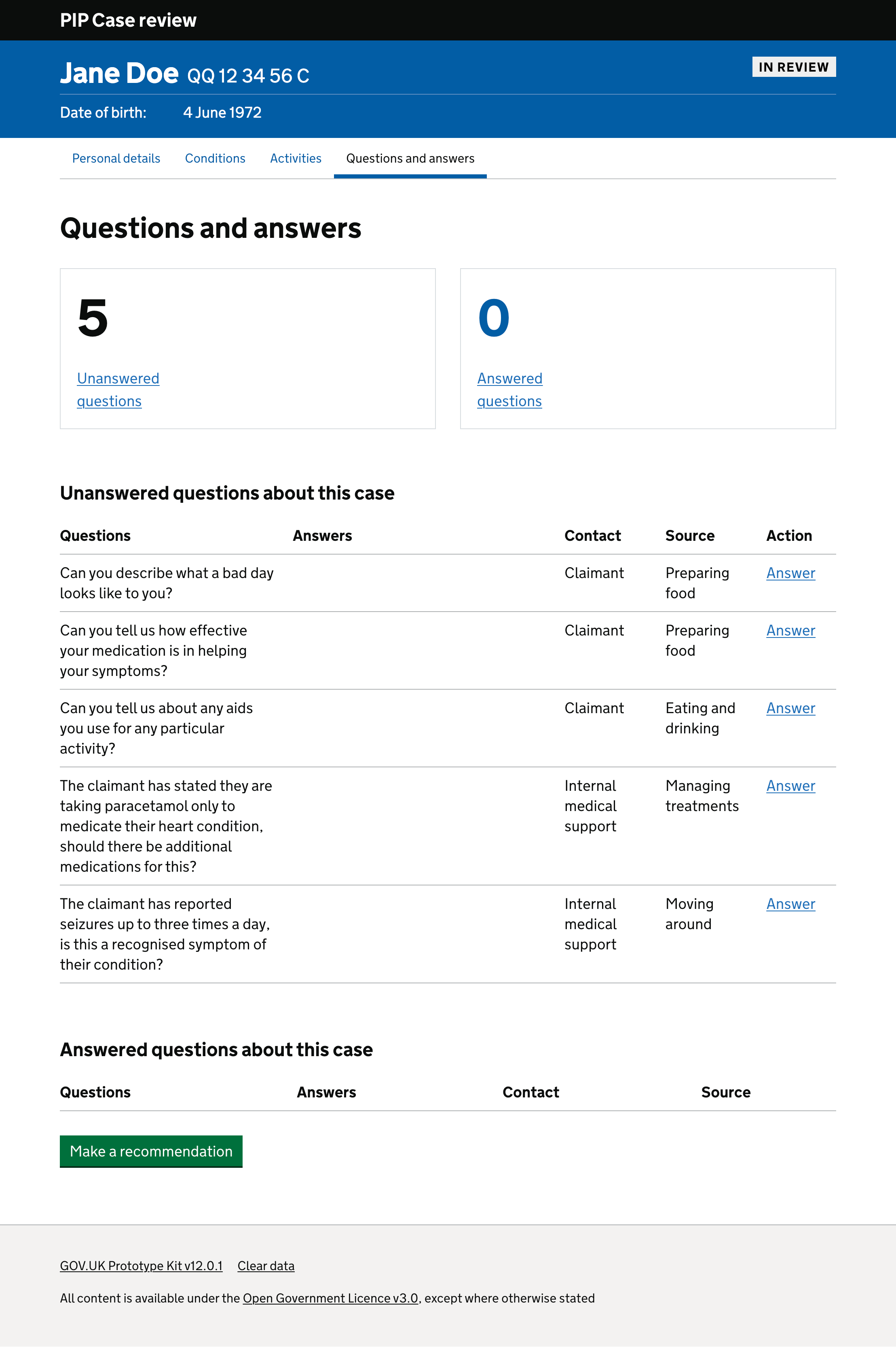
Questions and answers - Something that case officers told us they needed. An area where they could record any questions they needed to ask an applicant or medical professional based on what they had read from the applicant’s responses. They currently do this on a separate piece of paper
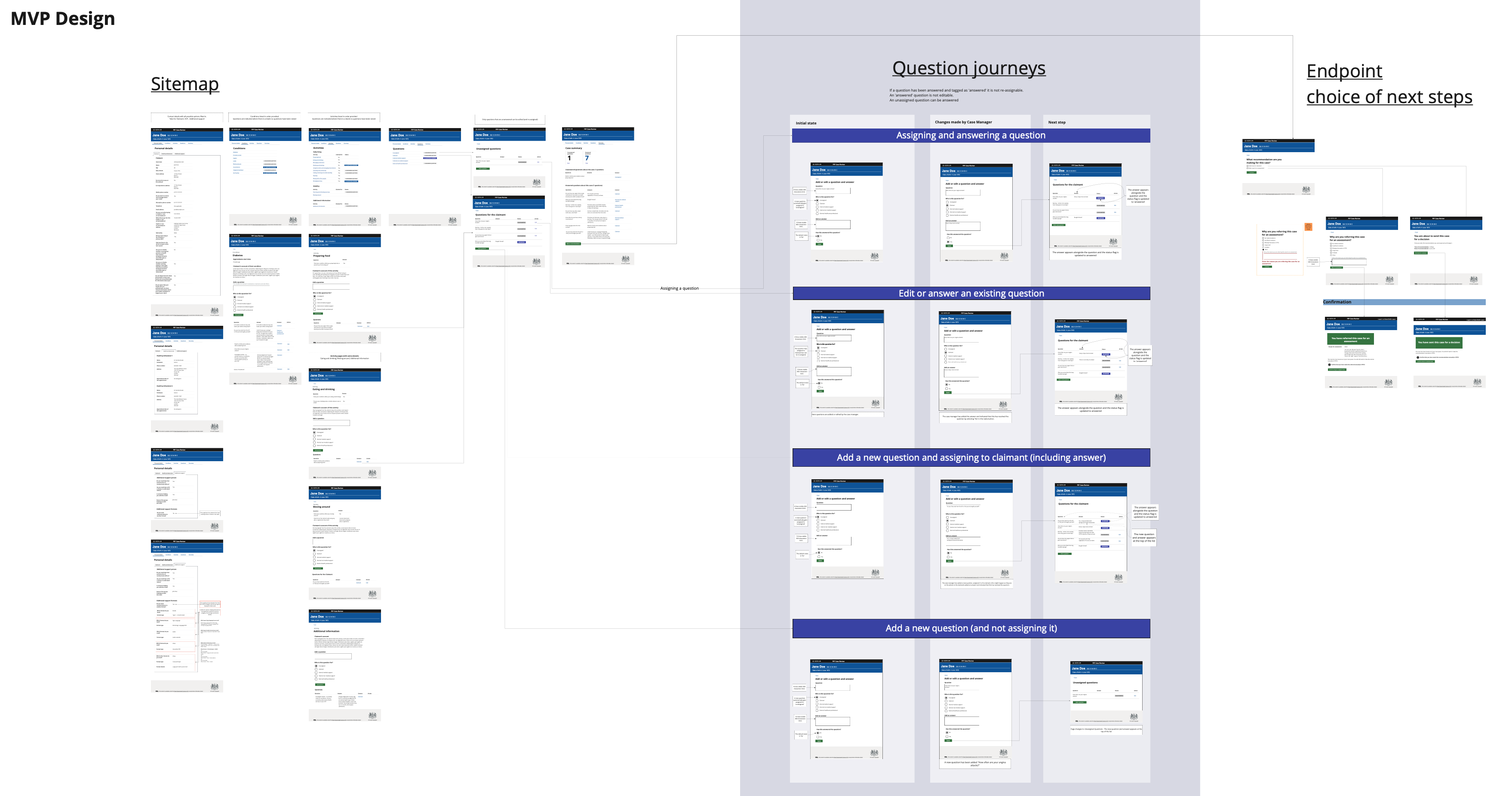
The full scale of the Case review process and the user journeys are displayed in the complete sitemap below. This is created in Mural and the prototype in the GDS toolkit.
My role
As a Senior Interaction Designer, I worked across both early concepts and improvements to the live service. My focus was on simplifying complex data interactions and shaping user journeys that worked for both publishers and end users.
The result
- Designed screens for applicants personal details, conditions and activities.
- Revised the content order and layout after a series of user research sessions.
- Created working Prototypes using the GDS Toolkit hosted on Heroku.
- Coded a sophisticated prototype to enable case managers to add questions about a case on specific conditions, activities or evidence. These were logged as either answered or unanswered question.
- Worked closely with other DWP departments to create a consistent lefthand navigation that would work across different applications
Through iterative usability testing and collaboration with service designers and user researchers, the prototype evolved into a simplified workflow that reduced unnecessary interaction steps and improved clarity for case officers.
Outcomes and impact
Feedback informed the team we needed a working prototype that allowed case workers to review a claimants details, responses and record any questions they had.
These questions were assigned to either a claimant, or an internal or external medical support professional for answers. The prototype presented a dynamic number of unanswered questions which increased as more questions were asked.
I enabled case officers to record the answers to these questions in the system and the number decreased dynamically.
The interesting twist was after user testing with case workers they realised they didn't want a question or answer section.
They often did not receive any answers and often would't want their notes logged in the assessment. Consequently, the option of adding and removing a questions was removed,
resulting in a much smoother user journey. A full description of these changes can be seen in the Powerpoint presentation which I presented back to the project team.
I also applied similar government interaction design principles within the Planning Data case study.