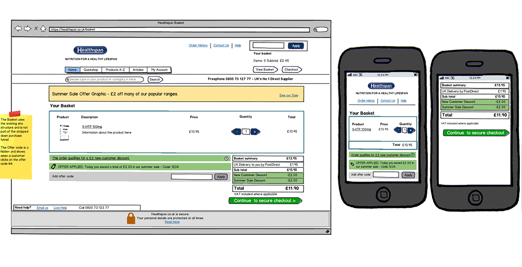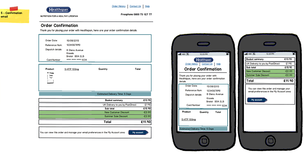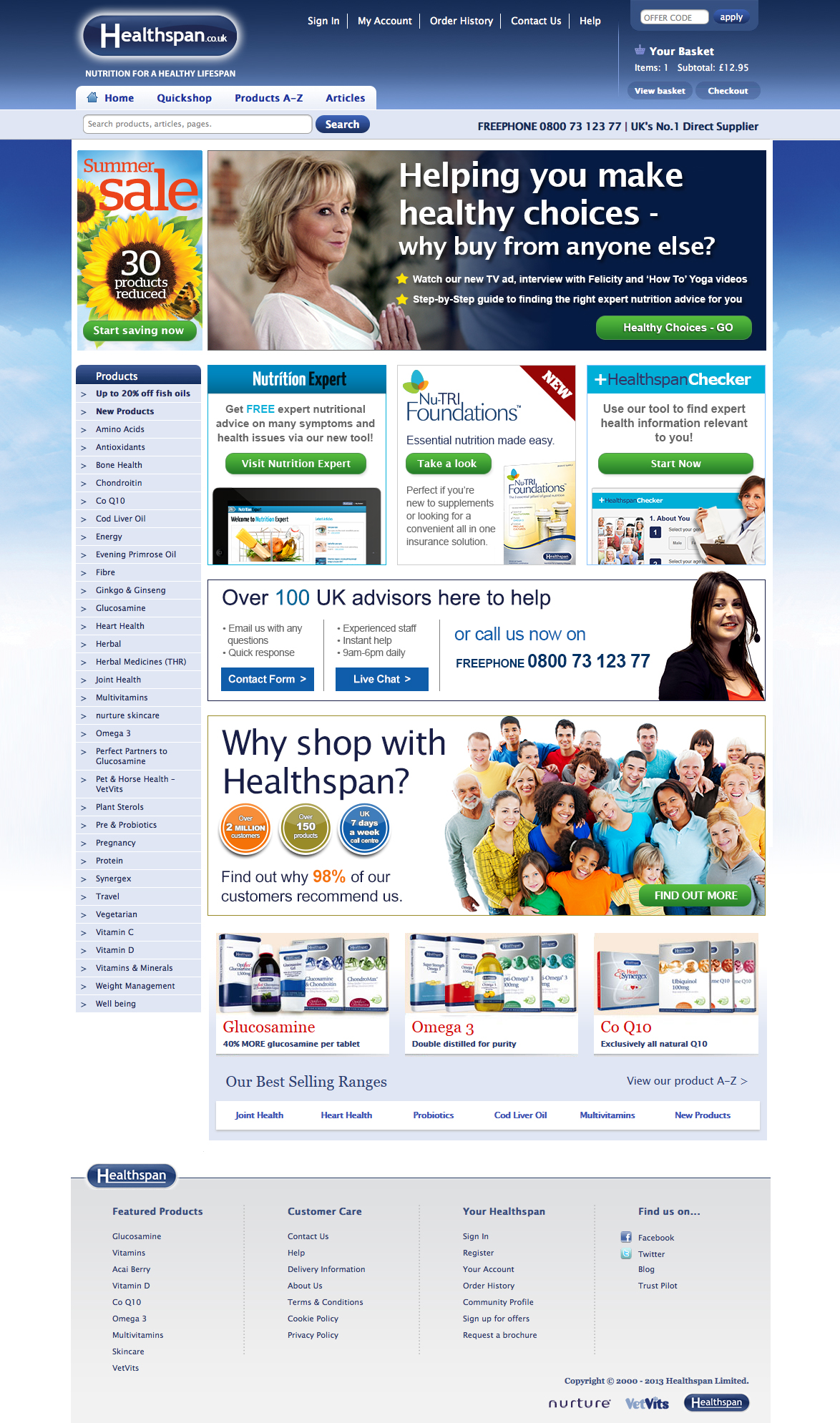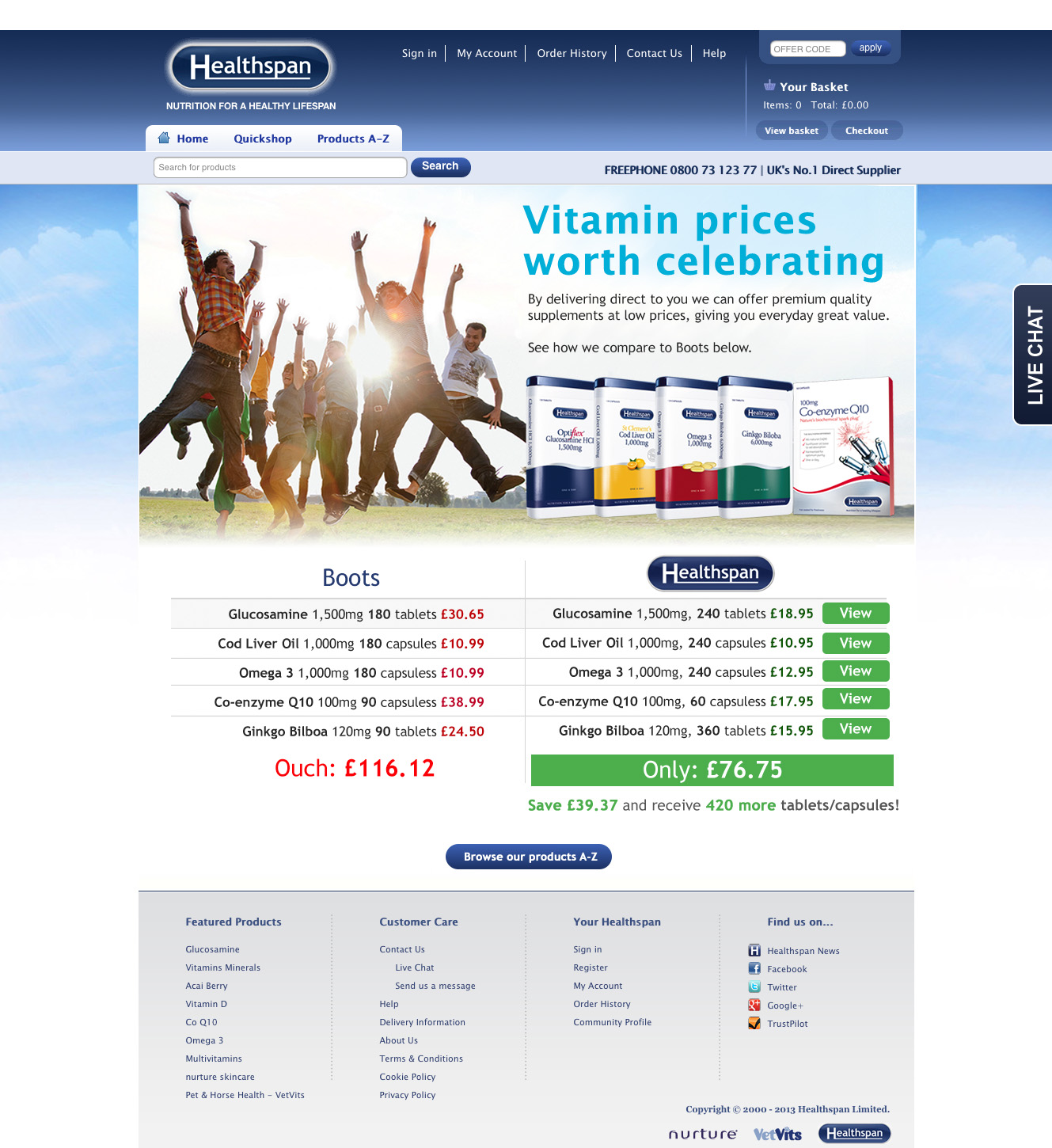
The challenge
Healthspan’s existing ecommerce checkout process was over five years old and suffered from significant drop-off. Google Analytics data showed approximately 25% of users abandoned the purchase funnel before completion.
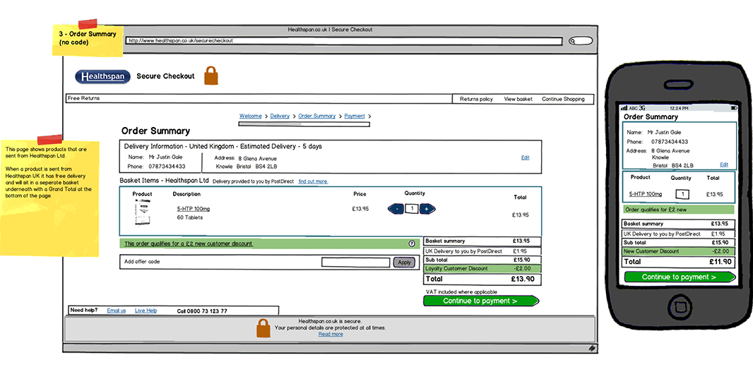
The five-step checkout contained multiple distractions, excessive links and unclear calls to action. It was not mobile responsive, creating friction for users browsing on tablets and smartphones — an audience that was rapidly increasing at the time.
Without improving usability and simplifying the interaction design, online revenue risked declining and pressure on telephone ordering services would increase.
The approach
As the interaction designer on the project, I reviewed the full customer journey and benchmarked against leading ecommerce platforms including Amazon, Boots and Holland & Barrett.
- Simplified the checkout from five stages to a streamlined sequence
- Removed non-essential content and visual distractions
- Applied mobile-first UX principles
- Reduced cognitive load through clearer hierarchy and calls to action
- Validated improvements through user testing and analytics
The result
The redesigned checkout delivered measurable business impact:
- 4% increase in total online sales
- 30% increase in mobile conversions
- Reduced checkout abandonment
- Decrease in customer service calls related to checkout issues
This project demonstrates how strategic UX and interaction design improvements can influence ecommerce performance.